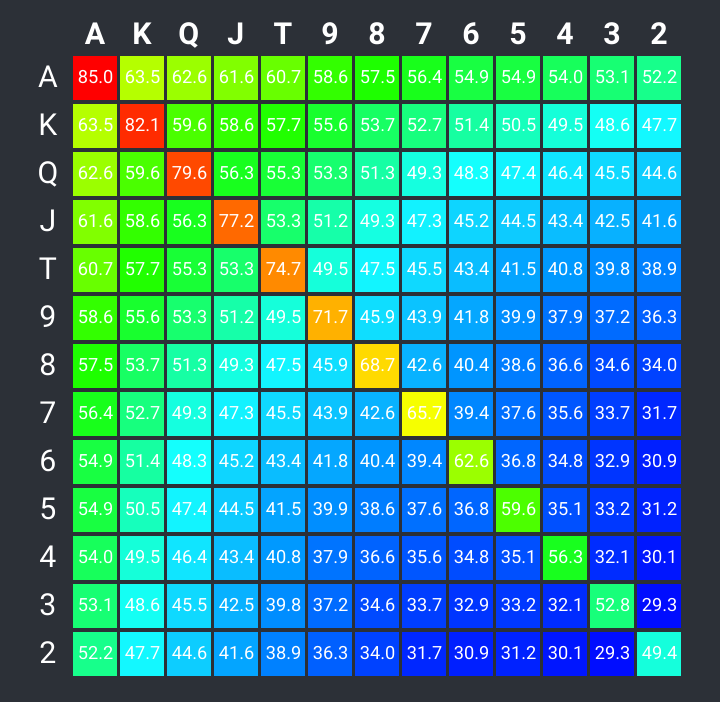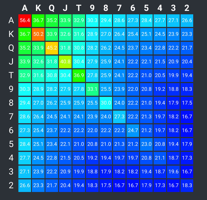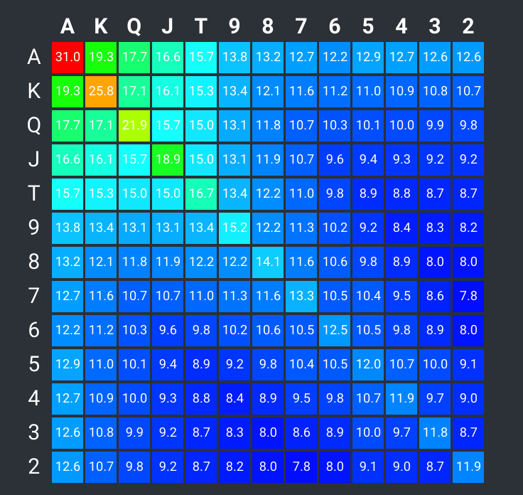
You are probably familiar with Texas Holdem, a variant of poker where two cards, known as hole cards, are dealt face down to each player, and then five community cards are dealt face up in three stages, for a total of four stages in all. After each stage, players have the opportunity to bet or raise.
Let’s say you’re dealt two hole cards. Before the flop is dealt, what are your chances of winning? Know this and you can bet, or plan to bet, accordingly.
Professor Apu Kapadia of Indiana University took a statistical approach to analyzing this by running 4 billion simulated games of poker to determine the outcomes. Several 169-row lists were the result, showing winning percentages based on number of players, from two to ten. Though each list is very informative, with that may rows it can be hard to see any pattern in the numbers, other than showing high ranking hole cards win more often than low ranking hole cards.
Awhile back I created a simple heat map package. Looking for a practical use, I ran across Dr. Kapadia’s statistics and they were a perfect for a demonstration.
Massaging the statistics
Since each set of statistics are inconveniently embedded in HTML, I had two options:
- screen-scrape the data from the rendered Document Object Model using Cheerio or equivalent;
- cut and paste the stats on the rendered HTML page into a file, then convert that to JSON format using some regex magic
Since the stats bore a copyright notice, I asked which method the Professor would prefer, and he was okay with option 2. The regex wasn’t too hard to write, and so I wound up with JSON like the following:
const arry = [
  { pair: 'AA', wins: '84.97	 ', ties: '0.57	' },
  { pair: 'KK', wins: '82.10	 ', ties: '0.58	' },
  { pair: 'QQ', wins: '79.63	 ', ties: '0.61	' },
  { pair: 'JJ', wins: '77.16	 ', ties: '0.65	' },
  { pair: 'TT', wins: '74.66	 ', ties: '0.72	' },
  { pair: '99', wins: '71.69	 ', ties: '0.80	' },
  { pair: '88', wins: '68.72	 ', ties: '0.91	' },
  { pair: '77', wins: '65.72	 ', ties: '1.04	' },
  { pair: 'KAs', wins: '65.28	 ', ties: '2.66	' },
  { pair: 'QAs', wins: '64.41	 ', ties: '2.78	' },...
This still wasn’t in the proper format for the head map API, but few lines of code took care of that.
Now all was ready.
The heat map API
The jsheatmap package was written in TypeScript, and takes the following constructor parameters:
type labeledValuesType = [string, number[]]

class Sterno {
  headings: Array<string>
  rows: Array<labeledValuesType>

  constructor(headings: string[], rows: Array<labeledValuesType>) {...
There is also a method getData() that when called, will return a data structure that shows how the raw input data was scaled, and what the corresponding color gradient will be for each scaled value:
| [ | |
| { | |
| "label": "A", | |
| "cells": { | |
| "values": [ | |
| 84.97, | |
| 63.49, | |
| 62.57, | |
| 61.63, | |
| 60.7, | |
| 58.6, | |
| 57.54, | |
| 56.36, | |
| 54.91, | |
| 54.94, | |
| 53.95, | |
| 53.08, | |
| 52.24 | |
| ], | |
| "colors": [ | |
| { | |
| "red": 1, | |
| "green": 0, | |
| "blue": 0 | |
| }, | |
| { | |
| "red": 0.713900862068966, | |
| "green": 1, | |
| "blue": 0 | |
| }, | |
| { | |
| "red": 0.6106321839080462, | |
| "green": 1, | |
| "blue": 0 | |
| }, | |
| { | |
| "red": 0.5051185344827589, | |
| "green": 1, | |
| "blue": 0 | |
| }, | |
| { | |
| "red": 0.40072737068965536, | |
| "green": 1, | |
| "blue": 0 | |
| }, | |
| { | |
| "red": 0.16500538793103448, | |
| "green": 1, | |
| "blue": 0 | |
| }, | |
| { | |
| "red": 0.04602191091954, | |
| "green": 1, | |
| "blue": 0 | |
| }, | |
| { | |
| "red": 0, | |
| "green": 1, | |
| "blue": 0.08643139367816093 | |
| }, | |
| { | |
| "red": 0, | |
| "green": 1, | |
| "blue": 0.24919181034482774 | |
| }, | |
| { | |
| "red": 0, | |
| "green": 1, | |
| "blue": 0.24582435344827594 | |
| }, | |
| { | |
| "red": 0, | |
| "green": 1, | |
| "blue": 0.35695043103448243 | |
| }, | |
| { | |
| "red": 0, | |
| "green": 1, | |
| "blue": 0.4546066810344828 | |
| }, | |
| { | |
| "red": 0, | |
| "green": 1, | |
| "blue": 0.5488954741379307 | |
| } | |
| ], | |
| "scales": [ | |
| 1, | |
| 0.6142241379310346, | |
| 0.5977011494252874, | |
| 0.5808189655172414, | |
| 0.5641163793103449, | |
| 0.5264008620689655, | |
| 0.5073635057471264, | |
| 0.48617097701149425, | |
| 0.46012931034482757, | |
| 0.46066810344827586, | |
| 0.4428879310344828, | |
| 0.42726293103448276, | |
| 0.4121767241379311 | |
| ] | |
| } | |
| }, | |
| { | |
| "label": "K", | |
| "cells": {... |
Now all that is left is to present the map data in a pleasing format.
The React application
Although create-react-app is overkill for this example, it is still the quickest way I’ve found to get a react application up and running. After the script is done running, I just edit the code that was generated.
The first thing I want to do is to add some user interactivity by way of radio buttons and check boxes. There are three things the user can specify:
- number of players
- suited or unsuited hole cards
- whether to include ties
I’ve mentioned the effect of number of players. If hole cards are suited (both are hearts, for example), then winning odds increase a small amount. Ties are when pots are split because two or more players have the same rank of cards in their 5-card hand (their two hole cards plus three of the five community cards).
Several screenshots follow:


What the heat map makes noticeable
You can verify the following at https://pokermap.netlify.com
More players lessen the odds
With 2 players, there’s a lot of green towards the upper left, indicating better odds for higher-ranking hole cards in a two-player game (about 50% for an A-2, about the same as a pair of 2’s). With 10 players, is significantly worse that two 2’s.
Low ranking pairs don’t help much
With 10 players, a pair of 6’s has about the same or less winning chances as any unpaired face card combination.
Suited hole cards have more of an effect when there are more players
K-Q unsuited in a 2 player game wins 59% of the time. Suited, the percentage increases only slightly to 61.6%. In a 10-player game, unsuited K-Q as a 13.6% chance of winning, but this jumps to 17.1% when suited.
Conclusion
I think this post has demonstrated that even a simple heat map can be useful for finding patterns and correlations in large amounts of data. Feel free to explore the source code for both jsheatmap and pokermap on github.